Score |
79


Bits and Pieces Part 4: Just Click, Blink, You're In

<p><strong><em>It’s not a sudden stroke of genius.</em></strong></p><p>It’s slow, <strong>painful</strong> attrition.
</p><p>I'm watching users churn before they even sign up. Not just on my app, everywhere. Look around. People want *frictionless access* to everything, and rightfully so. If you’ve ever watched someone try to sign up for a course using their tiny phone on 2G internet, you know: the enemy isn’t bad design, it’s <strong>too much</strong> design.
</p><p>Every extra input field becomes a reason to quit.
</p><p>There’s something deeply <strong>offensive</strong> about filling out another signup form in <strong>2025</strong>. It’s not even the time it takes, it’s the <strong>audacity</strong> of it. You’re telling me to enter my email, confirm my password (twice), solve a CAPTCHA, click a verification link in my inbox… just so I can <em>maybe</em> look around your app?
</p><p>So I'm tracking <strong>user intent vs user action</strong>.</p><p>Someone clicks “Sign Up.” Great. That’s <strong>i</strong><strong>ntent</strong>. But then they see six fields… and drop off halfway. That’s <strong>failure</strong>.
</p><p>But it’s not their failure, it’s ours. We built the wall. They just refused to climb it.
</p><p><strong>The Button Revelation</strong></p><p>I realized: we don’t need a <strong>better </strong>form.
</p><p>We need <strong>no form — </strong>call me crazy.
</p><p>Just <strong>one button</strong>. And not just any button, a trusted one. Something users already recognize. Something their browser autofills. Something their device already authorizes.
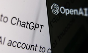
</p><p>Google. Obviously.
</p><p>But just slapping a “Continue with Google” button isn’t enough. You have to understand why it works. Google Sign-In is just the costume. The real actor underneath? OAuth 2.0. That’s the protocol. The handshake. The reason it’s secure, portable, universal.</p><p><br/></p><p><strong>You’ve just signed up. Great. Now what?
</strong></p><p>Most websites just… stop. Like a cab driver slamming the brakes two blocks before your actual destination and then expecting a five-star rating. You’re left standing there with a fresh user account and <em>zero direction</em>, like someone handed you a gym membership and no clue what a deadlift is.
</p><p>That kind of design makes my <em style="">eye twitch</em>. </p><p>So I'm fixing it!</p><p>I'm wiring up my own modal system — basically a pop-up interface from a video game, backed by a Web Token, powered by my database state, to track one thing: <em>did this user make a decision?</em></p><p>That’s where<em> </em><em style="">Aula’s onboarding ends</em>. And <em>behavioral insight begins.</em></p><p><strong><em>The idea is simple: signing up should feel like hitting the jackpot</em></strong>.
</p><p>A toast shows up right after the 200 OK lands, flashing <em>"Account successfully created”</em>, animated with a countdown bar, then vanishes after 2 seconds like it was never there.
</p><p><strong>Boom.</strong></p><p>Modal takes over.
</p><p>Two roads diverge: "<em>Do you want to create a classroom, or just browse?"</em></p><p>No backend engineering degree required, just a clean fork in the user journey. Visually intuitive. Programmatically deterministic. Use either the Google Sign-In option or the traditional email/password combo. Both wired. Both clean.</p><p><br/></p><p><strong>Let’s make the dream real.</strong></p><p>We need <strong>one</strong> button. Not metaphorically. Literally. A single, elegant button that skips the bureaucracy and <em>just logs you in</em>.
</p><p>That's the dream.
</p><p>And dreams, as I’ve found, start with a problem and end in documentation.
</p><p>The problem? User drop-off.
</p><p>The solution? After chasing it through forums, GitHub issues, and open tabs that threatened to crash my browser… OAuth.</p><p>OAuth isn’t new, but understanding it feels like solving a Rubik’s cube with the lights off. It’s the invisible contract that lets one service (Google, Facebook, GitHub) vouch for you on another (mine). But you don’t ask Google directly, you use a layer.
</p><p>That’s where Auth.js came in — a framework so clean it felt like cheating.
</p><p><strong>Auth.js didn’t just give me OAuth. It gave me control.</strong></p><p>Here’s what that really means:</p><p>Fine-grained callbacks — secret trapdoors that let you whisper logic into the login pipeline. “Tag this user with `hasOnboarded: false` before anything else happens.” That kind of Jedi-level precision.
</p><p>JWT support — we’re not babysitting sessions in server memory like it’s 2012. Tokens carry everything, user ID, timestamps, secret, like a digital carry-on. Stateless. Scalable. Slick.
</p><p>Provider system like Legos — want Google? Snap it in. GitHub tomorrow? Slot it in. No duct tape. No voodoo. Just clean, declarative config.
</p><p>The docs became **scripture**. You open them expecting chaos. You get divine revelation.
</p><p>Install the package — that’s the ceremonial door knock.
</p><p>Create your `auth` config file — the sacred gatekeeper, the programmable customs agent. Every login, every callback, filtered through one chokepoint.
</p><p>Set your strategy. We picked JWT — tokens over sessions, always.
</p><p>Pick your providers. We picked Google — fast, familiar, trusted. But knowing the whole <em>OAuth pantheon</em> is one config away? Comforting.
</p><p>Then the final ritual: you dive into the <strong>Google Cloud Console</strong>, which is less “console” and more hostile UI from 2014. You fill out your consent screen, name your app, and receive your <strong>Client ID </strong>and <strong>Client Secret,</strong> your passport to the ecosystem.
</p><p>You put them where they belong: your `.env`. Not your code. <strong>Never</strong> your code. Because security is mostly just not putting things where they don’t belong.</p><p>Now your app speaks OAuth. When a user clicks “Sign In with Google,” it’s not just a UI event, it’s choreography. Your app hands them off. Google verifies. Hands them back. Credentials intact. Identity verified.
</p><p>All of that, millions of lines of infrastructure, triggered by one button.
</p><p>And that button? Surprisingly simple. It just calls a function: "Start Google login.” It succeeds, returns a session, and if the session exists? Redirect to dashboard.
</p><p>No middle forms. No confirmation emails. No friction. Just <em><strong>click</strong></em>, <strong><em>blink</em></strong>, and <strong><em>you’re in</em></strong>.
</p><p><br/></p><p><br/></p><p><strong>Then there was the rogue flow.</strong></p><p>The traditional email/password signup worked fine. It was predictable. We owned the state. We owned the flow. When a user hit “Sign Up,” we could fire off a toast, start a timer, and trigger the modal like a cinematic cutscene.
</p><p>But Google OAuth?
</p><p>It skipped the frontend entirely. Dropped users in through the backdoor. It was clean, fast, and *completely outside* our visual pipeline.
</p><p>So we are reverse-engineering the same feel, the same joyful little UX illusion, for OAuth signups.
</p><p><strong>And everything became a "state game".
</strong></p><p>I don’t mean mental state. I mean literal React state.
</p><p>Booleans. Flags. Truths. Lies. Timing.
</p><p>Invisible logic that controls everything.
</p><p>First, the database needed to remember something the frontend could never guess: <em>had this user ever onboarded?</em></p><p>That meant adding a boring little field to our Prisma schema: `hasOnboarded: Boolean`. Not sexy. But critical.
</p><p>Because Google Sign-In never hits `/signup`, we had to store that truth somewhere deeper.
</p><p><strong>That truth lives in the JWT.</strong></p><p>We are hijacking the `jwt` callback, the sacred little Auth.js hook that fires when a session is created. If the user is new, we tag them: `hasOnboarded: false`. That flag is passed into the token.</p><p>We almost missed the part where we were actually going to update the hasOnboarded and change its value by creating a rest api patch and updating it whenever the user clicks on either "continue browsing" or "create classroom"</p><p> Then into the session. Then to the frontend.
</p><p>The frontend reads it. And reacts.</p><p>But timing still matters.
</p><p>We wanted a toast, a tiny, satisfying “Account successfully created” flash, to show up right after signup, then vanish like confetti. Not clingy. Just celebratory.
</p><p>We used `setTimeout`. Mount the toast. Start the 2-second timer. On timeout? Unmount the toast. Trigger the modal.
</p><p>But timers are sneaky.
</p><p>If the component unmounts early, or if `showToast` toggles too soon, we risk a memory leak or, worse, a rogue modal flash on re-render.
</p><p>So inside `useEffect`, we added a cleanup function that calls `clearTimeout`. That was the missing puzzle piece.
</p><p>Before that? One user reported the modal showing up *twice*. A late-night console.log autopsy traced it to, you guessed it, a dangling timeout.
</p><p>Fixed it. Cleaned it up.
</p><p>Now the toast lifecycle feels natural. Declarative.</p><p>You sign up. Toast shows. It fades. Modal enters. You choose a path. The journey begins.
</p><p>All of this was possible because we treated the modal and toast as dumb components, visual puppets controlled by smart parents.
</p><p>`showToast` and `showModal` are booleans in the parent component. Passed down as props. The toast doesn’t know what `showToast` means. It just listens. Same with the modal.
</p><p>Handlers like `onClose`, `onContinue`, `onCreateClassroom`, they’re passed down like mission instructions. The modal doesn’t need to understand them. It just executes.
</p><p>Routing? Logic? That lives upstairs, where router.push(...)` lives.
</p><p>That’s how we rebuilt onboarding to feel unified, whether it came from a traditional form or a clean Google glide-in.
</p><p>At the heart of all this:
</p><p><strong>Did the user just sign up? Or are they returning?</strong></p><p>If you can’t answer that, you can’t tailor the experience.
</p><p>You’ll either nag veterans with modals they don’t need or ghost rookies who need direction.
</p><p>So we built the whole system to detect one exact moment:
</p><p>The user’s first successful login.</p><p>That’s all onboarding ever was, not just authentication, but affirmation.
</p><p>You belong here.</p><p>We built Aula to get out of your way.
</p><p>And get you in. Fast.</p><p><br/></p><p>
</p>

Bits and Pieces Part 4: Just Click, Blink, You'...
By
 Zeus
•
5 plays
Zeus
•
5 plays
Zeus
•
5 plays
0:00 /
0:00


 252
252


Other insights from Zeus


Referral Earning

Points-to-Coupons

Insights for you.


Social media is not an actual place
A statement used to mock ideas and opinions on the platform, while this is true; like a...
1320 views
8 upvotes
6 comments


Meet Amina the AI
Well yes, the image attached to this post was created with DALLE. After some interestin...
1115 views
11 upvotes
6 comments


DIGITAL BURNOUT/FATIGUE
Do you usually feel ‘blah’ while mindlessly scrolling for hours on Instagram/Facebook? ...
1008 views
4 upvotes
2 comments


The future is AI
If you're interested in content creation like me or keep up with the latest technologic...
958 views
3 upvotes
0 comments


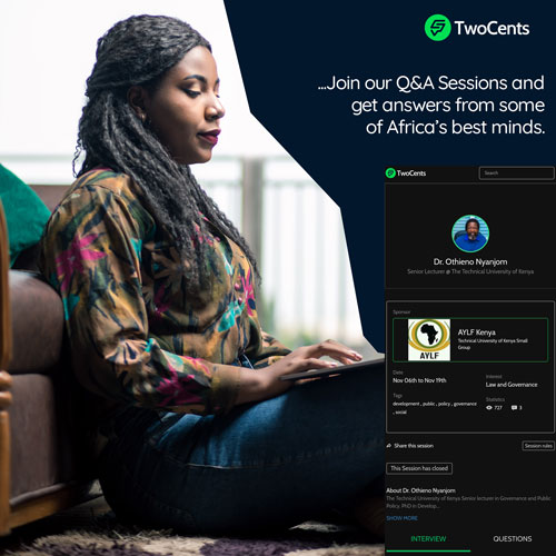
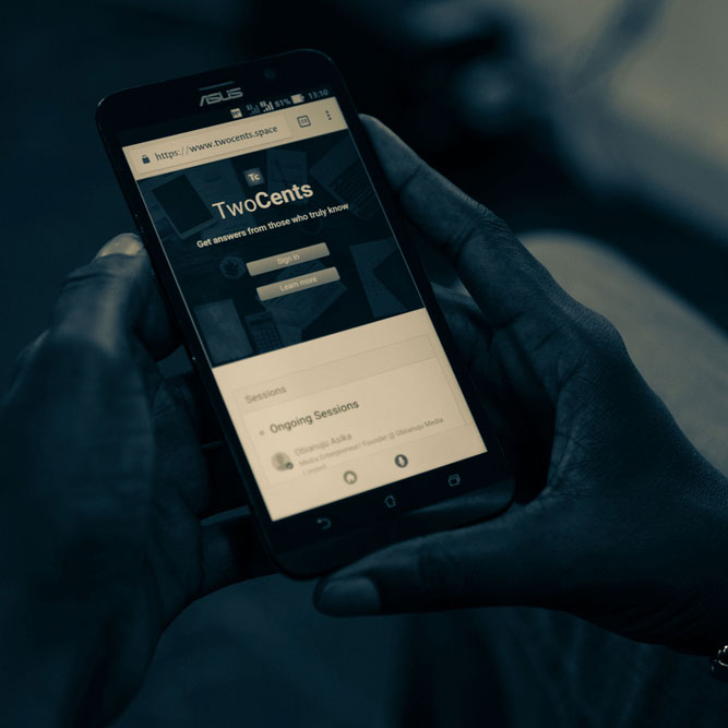
I’m In Love With TwoCents
I’ve been building social products for 8 years. Social networks, social games, social p...
900 views
8 upvotes
3 comments


Tech is the New White Collar Job
Tech is the New White Collar Job
Tech is the new currency; with tech, you can say cr...
864 views
7 upvotes
7 comments


Comments